Free Resources to Improve Your Writing
Browse PaperTrue’s Resource Centre to learn how to make your words count.

Resources for Students
A stellar academic paper adds to the knowledge of the world. Browse through these free resources to improve your academic writing skills.
Resources for Authors
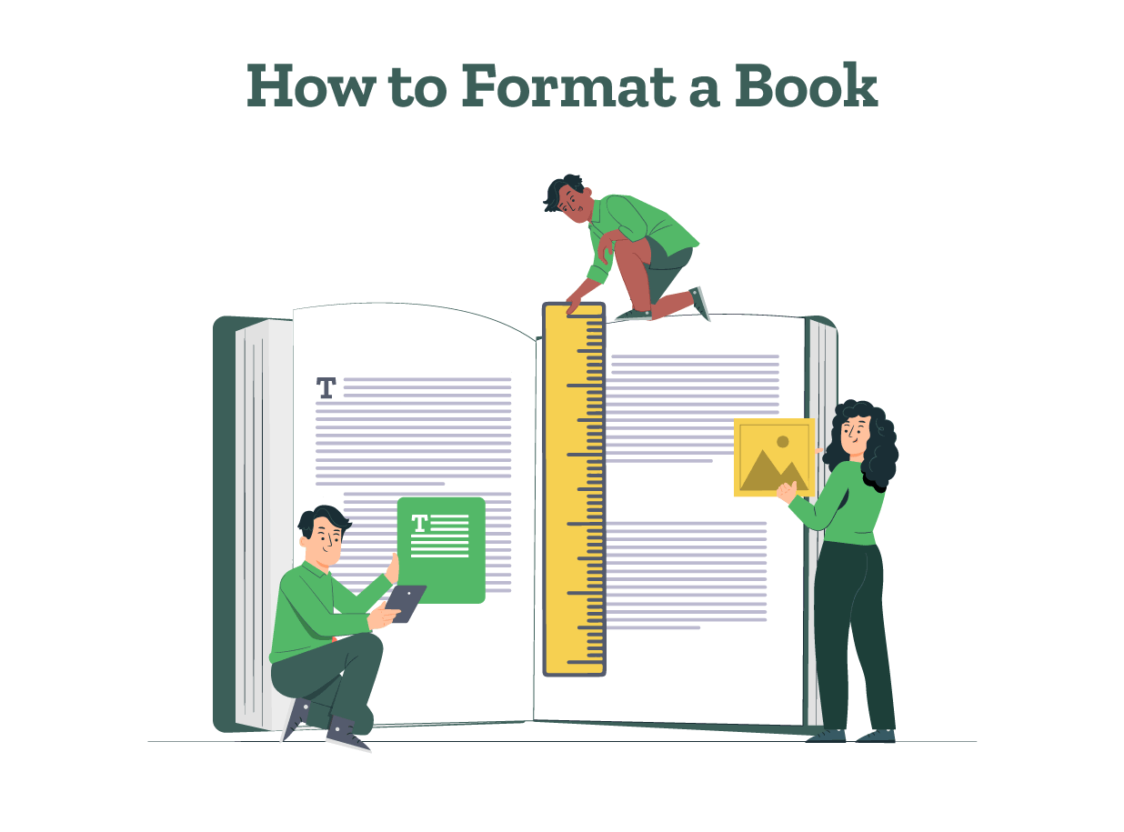
Putting words on paper is just the first step; there’s much to be done after that. Browse through these free resources to learn about writing and publishing a book.
 May 04, 2025
 6 min read