- A List of Writing Contests in 2022 | Exciting Prizes!
- Em Dash vs. En Dash vs. Hyphen: When to Use Which
- Book Proofreading 101: The Beginner’s Guide
- Screenplay Editing: Importance, Cost, & Self-Editing Tips
- Screenplay Proofreading: Importance, Process, & Cost
- Script Proofreading: Rates, Process, & Proofreading Tips
- Manuscript Proofreading | Definition, Process & Standard Rates
- Tips to Write Better if English Is Your Second Language
- Novel Proofreading | Definition, Significance & Standard Rates
- Top 10 Must-Try Writing Prompt Generators in 2024
- 100+ Creative Writing Prompts for Masterful Storytelling
- Top 10 eBook Creator Tools in 2024: Free & Paid
- 50 Timeless and Unforgettable Book Covers of All Time
- What Is Flash Fiction? Definition, Examples & Types
- 80 Enchanting Christmas Writing Prompts for Your Next Story
- Your Guide to the Best eBook Readers in 2024
- Top 10 Book Review Clubs of 2025 to Share Literary Insights
- 2024’s Top 10 Self-Help Books for Better Living
- Writing Contests 2023: Cash Prizes, Free Entries, & More!
- What Is a Book Teaser and How to Write It: Tips and Examples
- Audiobook vs. EBook vs. Paperback in 2024: (Pros & Cons)
- How to Get a Literary Agent in 2024: The Complete Guide
- Alpha Readers: Where to Find Them and Alpha vs. Beta Readers
- Author Branding 101: How to Build a Powerful Author Brand
- A Guide on How to Write a Book Synopsis: Steps and Examples
- How to Write a Book Review (Meaning, Tips & Examples)
- 50 Best Literary Agents in the USA for Authors in 2024
- Building an Author Website: The Ultimate Guide with Examples
- Top 10 Paraphrasing Tools for All (Free & Paid)
- Top 10 Book Editing Software in 2024 (Free & Paid)
- What Are Large Language Models and How They Work: Explained!
- Top 10 Hardcover Book Printing Services [Best of 2024]
- 2024’s Top 10 Setting Generators to Create Unique Settings
- Different Types of Characters in Stories That Steal the Show
- Top 10 Screenplay & Scriptwriting Software (Free & Paid)
- 10 Best AI Text Generators of 2024: Pros, Cons, and Prices
- Top 10 Must-Try Character Name Generators in 2024
- 10 Best AI Text Summarizers in 2024 (Free & Paid)
- 2024’s 10 Best Punctuation Checkers for Error-Free Text
- 11 Best Story Structures for Writers (+ Examples!)
- How to Write a Book with AI in 2024 (Free & Paid Tools)
- Writing Contests 2024: Cash Prizes & Free Entries!
- Patchwork Plagiarism: Definition, Types, & Examples
- Simple Resume Formats for Maximum Impact With Samples
- What Is a Complement in a Sentence? (Meaning, Types & Examples)
- What are Clauses? Definition, Meaning, Types, and Examples
- Persuasive Writing Guide: Techniques & Examples
- How to Paraphrase a Text (Examples + 10 Strategies!)
- A Simple Proofreading Checklist to Catch Every Mistake
- Top 10 AI Resume Checkers for Job Seekers (Free & Paid)
- 20 Best Comic Book Covers of All Time!
- How to Edit a Book: A Practical Guide with 7 Easy Steps
- How to Write an Autobiography (7 Amazing Strategies!)
- How to Publish a Comic Book: Nine Steps & Publishing Costs
- Passive and Active Voice (Meaning, Examples & Uses)
- How to Publish a Short Story & Best Publishing Platforms
- What Is Expository Writing? Types, Examples, & 10 Tips
- 10 Best Introduction Generators (Includes Free AI Tools!)
- Creative Writing: A Beginner’s Guide to Get Started
- How to Sell Books Online (Steps, Best Platforms & Tools)
- Top 10 Book Promotion Services for Authors (2025)
- 15 Different Types of Poems: Examples & Insight into Poetic Styles
- 10 Best Book Writing Apps for Writers 2025: Free & Paid!
- Top 10 AI Humanizers of 2025 [Free & Paid Tools]
- How to Write a Poem: Step-by-Step Guide to Writing Poetry
- 100+ Amazing Short Story Ideas to Craft Unforgettable Stories
- The Top 10 Literary Devices: Definitions & Examples
- Top 10 AI Translators for High-Quality Translation in 2025
- Top 10 AI Tools for Research in 2025 (Fast & Efficient!)
- 50 Best Essay Prompts for College Students in 2025
- Top 10 Book Distribution Services for Authors in 2025
- Best 101 Greatest Fictional Characters of All Time
- Top 10 Book Title Generators of 2025
- Best Fonts and Sizes for Books: A Complete Guide
- What Is an Adjective? Definition, Usage & Examples
- How to Track Changes in Google Docs: A 7-Step Guide
- Best Book Review Sites of 2025: Top 10 Picks
- Parts of a Book: A Practical, Easy-to-Understand Guide
- What Is an Anthology? Meaning, Types, & Anthology Examples
- How to Write a Book Report | Steps, Examples & Free Template
- 10 Best Plot Generators for Engaging Storytelling in 2025
- 30 Powerful Poems About Life to Inspire and Uplift You
- What Is a Poem? Poetry Definition, Elements, & Examples
- Metonymy: Definition, Examples, and How to Use It In Writing
- How to Write a CV with AI in 9 Steps (+ AI CV Builders)
- What Is an Adverb? Definition, Types, & Practical Examples
- How to Create the Perfect Book Trailer for Free
- Top 10 Book Publishing Companies in 2025
- 14 Punctuation Marks: A Guide on How to Use with Examples!
- Translation Services: Top 10 Professional Translators (2025)
- 10 Best Free Online Grammar Checkers: Features and Ratings
- 30 Popular Children’s Books Teachers Recommend in 2025
- 10 Best Photobook Makers of 2025 We Tested This Year
- Top 10 Book Marketing Services of 2025: Features and Costs
- Top 10 Book Printing Services for Authors in 2025
- 10 Best AI Detector Tools in 2025
- Audiobook Marketing Guide: Best Strategies, Tools & Ideas
- 10 Best AI Writing Assistants of 2025 (Features + Pricing)
- How to Write a Book Press Release that Grabs Attention
- 15 Powerful Writing Techniques for Authors in 2025
- Generative AI: Types, Impact, Advantages, Disadvantages
- Top 101 Bone-Chilling Horror Writing Prompts
- 25 Figures of Speech Simplified: Definitions and Examples
- Top 10 AI Rewriters for Perfect Text in 2025 (Free & Paid)
- Best EBook Cover Design Services of 2025 for Authors
- Writing Contests 2025: Cash Prizes, Free Entries, and More!
- Top 10 Book Writing Software, Websites, and Tools in 2025
- National Novel Writing Month (NaNoWriMo)
- Best Horror Books of All Time (Must-Read List)
- Best Book Trailer Services
- What is a Book Copyright Page?
- Final Checklist: Is My Article Ready for Submitting to Journals?
- 8 Pre-Publishing Steps to Self-Publish Your Book
- 7 Essential Elements of a Book Cover Design
- How to Copyright Your Book in the US, UK, & India
- Beta Readers: Why You Should Know About Them in 2024
- How to Publish a Book in 2024: Essential Tips for Beginners
- Book Cover Design Basics: Tips & Best Book Cover Ideas
- Why and How to Use an Author Pen Name: Guide for Authors
- How to Format a Book in 2025: 7 Tips for Book Formatting
- What is Manuscript Critique? Benefits, Process, & Cost
- 10 Best Ghostwriting Services for Authors in 2025
- ISBN Guide 2025: What Is an ISBN and How to Get an ISBN
- Best Manuscript Editing Services of 2025
- How to Hire a Book Editor in 5 Practical Steps
- Self-Publishing Options for Writers
- How to Promote Your Book Using a Goodreads Author Page
- 7 Essential Elements of a Book Cover Design
- What Makes Typesetting a Pre-Publishing Essential for Every Author?
- 4 Online Publishing Platforms To Boost Your Readership
- Typesetting: An Introduction
- Quick Guide to Novel Editing (with a Self-Editing Checklist)
- Self-Publishing vs. Traditional Publishing: 2024 Guide
- How to Publish a Book in 2024: Essential Tips for Beginners
- How to Publish a Book on Amazon: 8 Easy Steps [2024 Update]
- What are Print-on-Demand Books? Cost and Process in 2024
- What Are the Standard Book Sizes for Publishing Your Book?
- How to Market Your Book on Amazon to Maximize Sales in 2024
- Top 10 Hardcover Book Printing Services [Best of 2024]
- How to Find an Editor for Your Book in 8 Steps (+ Costs!)
- What Is Amazon Self-Publishing? Pros, Cons & Key Insights
- Manuscript Editing in 2024: Elevating Your Writing for Success
- Know Everything About How to Make an Audiobook
- A Simple 14-Point Self-Publishing Checklist for Authors
- How to Write an Engaging Author Bio: Tips and Examples
- Book Cover Design Basics: Tips & Best Book Cover Ideas
- How to Publish a Comic Book: Nine Steps & Publishing Costs
- Why and How to Use an Author Pen Name: Guide for Authors
- How to Sell Books Online (Steps, Best Platforms & Tools)
- A Simple Guide to Select the Best Self-Publishing Websites
- 10 Best Book Cover Design Services of 2025: Price & Ratings
- How Much Does It Cost to Self-Publish a Book in 2025?
- Quick Guide to Book Editing [Complete Process & Standard Rates]
- How to Distinguish Between Genuine and Fake Literary Agents
- What is Self-Publishing? Everything You Need to Know
- How to Copyright a Book in 2025 (Costs + Free Template)
- The Best eBook Conversion Services of 2025: Top 10 Picks
- 10 Best Self-Publishing Companies of 2025: Price & Royalties
- 10 Best Photobook Makers of 2025 We Tested This Year
- Book Cover Types: Formats, Bindings & Styles
- ISBN Guide 2025: What Is an ISBN and How to Get an ISBN
- A Beginner’s Guide on How to Self Publish a Book (2025)
- Index in a Book: Definition, Purpose, and How to Use It
- How to Publish a Novel: Easy Step-By-Step Guide
- How to start your own online publishing company?
- 8 Tips To Write Appealing Query Letters
- Self-Publishing vs. Traditional Publishing: 2024 Guide
- How to Publish a Book in 2024: Essential Tips for Beginners
- What are Print-on-Demand Books? Cost and Process in 2024
- How to Write a Query Letter (Examples + Free Template)
- Third-person Point of View: Definition, Types, Examples
- How to Write an Engaging Author Bio: Tips and Examples
- How to Publish a Comic Book: Nine Steps & Publishing Costs
- Top 10 Book Publishing Companies in 2025
- 10 Best Photobook Makers of 2025 We Tested This Year
- Book Cover Types: Formats, Bindings & Styles
- ISBN Guide 2025: What Is an ISBN and How to Get an ISBN
- Index in a Book: Definition, Purpose, and How to Use It
- How to Publish a Novel: Easy Step-By-Step Guide
- How to Create Depth in Characters
- Starting Your Book With a Bang: Ways to Catch Readers’ Attention
- Research for Fiction Writers: A Complete Guide
- Short stories: Do’s and don’ts
- How to Write Dialogue: 7 Rules, 5 Tips & 65 Examples
- What Are Foil and Stock Characters? Easy Examples from Harry Potter
- How To Write Better Letters In Your Novel
- On Being Tense About Tense: What Verb Tense To Write Your Novel In
- How To Create A Stellar Plot Outline
- How to Punctuate Dialogue in Fiction
- On Being Tense about Tense: Present Tense Narratives in Novels
- The Essential Guide to Worldbuilding [from Book Editors]
- What Is Point of View? Definition, Types, & Examples in Writing
- How to Create Powerful Conflict in Your Story | Useful Examples
- How to Write a Book: A Step-by-Step Guide
- How to Write a Short Story in 6 Simple Steps
- How to Write a Novel: 8 Steps to Help You Start Writing
- What Is a Stock Character? 150 Examples from 5 Genres
- Joseph Campbell’s Hero’s Journey: Worksheet & Examples
- Novel Outline: A Proven Blueprint [+ Free Template!]
- Character Development: 7-Step Guide for Writers
- What Is NaNoWriMo? Top 7 Tips to Ace the Writing Marathon
- What Is the Setting of a Story? Meaning + 7 Expert Tips
- What Is a Blurb? Meaning, Examples & 10 Expert Tips
- What Is Show, Don’t Tell? (Meaning, Examples & 6 Tips)
- How to Write a Book Summary: Example, Tips, & Bonus Section
- How to Write a Book Description (Examples + Free Template)
- 10 Best Free AI Resume Builders to Create the Perfect CV
- A Complete Guide on How to Use ChatGPT to Write a Resume
- 10 Best AI Writer Tools Every Writer Should Know About
- How to Write a Book Title (15 Expert Tips + Examples)
- 100 Novel and Book Ideas to Start Your Book Writing Journey
- Exploring Writing Styles: Meaning, Types, and Examples
- Mastering Professional Email Writing: Steps, Tips & Examples
- How to Write a Screenplay: Expert Tips, Steps, and Examples
- Business Proposal Guide: How to Write, Examples and Template
- Different Types of Resumes: Explained with Tips and Examples
- How to Create a Memorable Protagonist (7 Expert Tips)
- How to Write an Antagonist (Examples & 7 Expert Tips)
- Writing for the Web: 7 Expert Tips for Web Content Writing
- 10 Best AI Text Generators of 2024: Pros, Cons, and Prices
- What are the Parts of a Sentence? An Easy-to-Learn Guide
- What Is Climax Of A Story & How To Craft A Gripping Climax
- What Is a Subject of a Sentence? Meaning, Examples & Types
- Object of a Sentence: Your Comprehensive Guide
- What Is First-Person Point of View? Tips & Practical Examples
- Second-person Point of View: What Is It and Examples
- 10 Best AI Essay Outline Generators of 2024
- Third-person Point of View: Definition, Types, Examples
- The Importance of Proofreading: A Comprehensive Overview
- Patchwork Plagiarism: Definition, Types, & Examples
- Simple Resume Formats for Maximum Impact With Samples
- The Ultimate Guide to Phrases In English – Types & Examples
- Modifiers: Definition, Meaning, Types, and Examples
- What are Clauses? Definition, Meaning, Types, and Examples
- Persuasive Writing Guide: Techniques & Examples
- What Is a Simile? Meaning, Examples & How to Use Similes
- Mastering Metaphors: Definition, Types, and Examples
- How to Publish a Comic Book: Nine Steps & Publishing Costs
- Essential Grammar Rules: Master Basic & Advanced Writing Skills
- Benefits of Using an AI Writing Generator for Editing
- Hyperbole in Writing: Definition and Examples
- 15 Best ATS-Friendly ChatGPT Prompts for Resumes in 2025
- How to Write a Novel in Past Tense? 3 Steps & Examples
- 10 Best Spell Checkers of 2025: Features, Accuracy & Ranking
- Foil Character: Definition, History, & Examples
- 5 Key Elements of a Short Story: Essential Tips for Writers
- How to Write a Children’s Book: An Easy Step-by-Step Guide
- How To Write a Murder Mystery Story
- What Is an Adjective? Definition, Usage & Examples
- Metonymy: Definition, Examples, and How to Use It In Writing
- Fourth-Person Point of View: A Unique Narrative Guide
- How to Write a CV with AI in 9 Steps (+ AI CV Builders)
- What Is an Adverb? Definition, Types, & Practical Examples
- How to Write A Legal Document in 6 Easy Steps
- 10 Best AI Story Generators in 2025: Write Captivating Tales
- How to Introduce a Character Effectively
- What is Rhetoric and How to Use It in Your Writing
- How to Write a Powerful Plot in 12 Steps
- How to Make Money as a Writer: Your First $1,000 Guide
- How to Write SEO Content: Tips for SEO-Optimized Content
- Types of Introductions and Examples
- What is a Cliffhanger? Definition, Examples, & Writing Tips
- How to Write Cliffhangers that Keep Readers Hooked!
- How to Write a Romance Novel: Step-by-Step Guide
- Top 10 Writing Tips from Famous Authors
- 10 Best Ghostwriting Services for Authors in 2025
- What is Ghostwriting? Meaning and Examples
- How to Become a Ghostwriter: Complete Career Guide
- How to Write a Speech that Inspires (With Examples)
- Theme of a Story | Meaning, Common Themes & Examples
- 10 Best AI Writing Assistants of 2025 (Features + Pricing)
- Generative AI: Types, Impact, Advantages, Disadvantages
- Worldbuilding Questions and Templates (Free)
- How to Avoid Plagiarism in 2025 (10 Effective Strategies!)
- How to Create Marketing Material
- What Is Worldbuilding? Steps, Tips, and Examples
- How to Avoid AI Detection in 2025 (6 Proven Techniques!)
- What is Syntax in Writing: Definition and Examples
- What is a Subplot? Meaning, Examples & Types
- Writing Challenges Every Writer Should Take
- What Is a Memoir? Definition, Examples, and Tips
- What Is Fiction? Definition, Types & Examples
Still have questions? Leave a comment
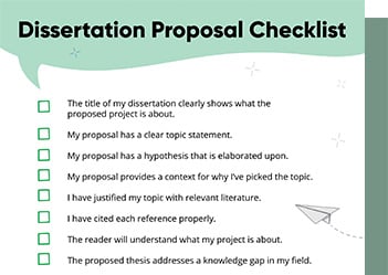
Checklist: Dissertation Proposal
Enter your email id to get the downloadable right in your inbox!
[contact-form-7 id="12425" title="Checklist: Dissertation Proposal"]
Examples: Edited Papers
Enter your email id to get the downloadable right in your inbox!
[contact-form-7 id="12426" title="Examples: Edited Papers"]Looking
to self-publish
your book?
How to Format a Book in 2025: 7 Tips for Book Formatting
 May 04, 2025
 6
min read
6
min read
Are you confused about how to format a book for publication? It’s easy to get scared by the many rules and specifics of book formatting, but don’t worry. We’ve included everything you need to know about formatting a book for print and digital formats. Formatting one’s own books can be challenging, but with our experience and solutions, such as free templates and proprietary software, we have overcome these obstacles.
Remember that formatting comes only after the three steps of book editing: developmental editing, copy editing, and line editing. If you start formatting a partially edited book, the process will be messy and involve a lot of rework. But if you’re happy with the edit, it’s time to work on the manuscript format.
But first, let’s answer a basic question: What exactly does book formatting involve?
What is book formatting?
Book formatting or typesetting is the process of preparing a manuscript for publication by selecting the right text and layout options. This process tailors your book to the technical specifications and design requirements of print and eBook formats. It involves structuring text, images, fonts, margins, and layout elements using paragraph styles and style-based formatting to boost readability and ensure consistency. Proper formatting can make life easier for authors by streamlining the process.
Book formatting deals with the following parts of your book:
- Text (font size and style, line spacing, and indents)
- Page layout (page size, margins)
- Front and end matter
- Chapter headings and subheadings
- Pagination
- Images, graphics, tables, and charts
- EBook formatting specifics (responsive design, hyperlinks, and image optimization)
Using style-based formatting, such as character and paragraph styles, is crucial for maintaining consistency and simplifying the layout process across your document.
Why is book formatting important?
Book formatting is important because it enhances your book’s readability and visual appeal, making it polished and professional. Your book format says a lot about its content. Readers will always choose a well-designed and accessible book over an amateurish one.
Even if you put a lot of creativity and effort into writing your book, readers won’t go through it if the layout is shabby. So, bad formatting undermines your work while polished formatting enhances it.
Setting up the book structure
Setting up the book structure is a crucial step in the formatting process, as it determines the overall organization and flow of your book. A well-structured book not only enhances readability but also ensures that all necessary elements are included and properly formatted.
The book structure typically includes three main parts: the front matter, body text, and back matter. Each of these sections has its own specific elements and formatting requirements.
Front Matter: This section includes the title page, copyright page, and table of contents. The title page should feature the book title, subtitle, and author name, all centered and formatted according to industry standards. The copyright page should contain the copyright notice, publication date, and ISBN. The table of contents should be clear and easy to navigate, helping readers find specific sections quickly.
Body Text: This is where the main content of your book resides. It should be formatted with clear headings, well-organized paragraphs, and appropriate line spacing to ensure readability. Consistency is key, so use the same font and font size throughout the body text to maintain a professional appearance.
Back Matter: This section includes any additional information, such as appendices, glossaries, or indexes. These elements should be formatted consistently with the rest of the book to provide a cohesive reading experience.
Using a word processor like Microsoft Word can make it easier to set up the book structure and format the different elements. By setting up the book structure correctly from the start, you can save time and effort in the long run, making it easier to make changes and updates to the book.
Now that we’ve seen what formatting is, it’s time to learn how to format a manuscript. Here are the steps to format a book for printing and/or digital publishing:
- Select the right formatting software
- Choose an appropriate page size
- Keep ample margins
- Use a readable font style and size
- Format your text
- Embellish chapter headings
- Create front and end matter
Let’s take a detailed look at each of these steps to book formatting:
How to format a book
#1 Select the right formatting software
While typesetting, you’ll have to choose a tool that’s compatible with your needs. If your book consists mostly of text and doesn’t need fancy formatting, you don’t need to use an advanced tool. Even Google Docs, Apple Pages, and MS Word work as great eBook creator tools! In MS Word, you can access text alignment options, such as left justification, through the Home tab.
That said, Draft2Digital’s free ebook creator is a great formatting tool and comes with various premade templates. If you’re comfortable paying for a tool, Atticus and Scrivener are some good choices. Ensure that the software you choose lets you create books in the file format you’ll need for publishing. Take a look:
| Formatting tool | EPUB | MOBI | |
|---|---|---|---|
| Draft2Digital | Yes | Yes | Yes |
| Scrivener | Yes | Yes | Yes |
| Atticus | Yes | Yes | - |
| Kindle Create | Yes | Yes | - |
| Apple Pages | Yes | Yes | - |
| Adobe InDesign | Yes | Yes | - |
| Google Docs | Yes | Yes | - |
| FlipHTML5 | Yes | Yes | - |
| Microsoft Word | Yes | - | - |
| Marq | Yes | - | - |
If you’re undertaking formatting for print books, you’ll need a PDF file. Formatting an eBook is slightly trickier because different online retailers use different file formats. While EPUB is the most widely used eBook format, you’ll have to create a MOBI or KPF file to publish on Amazon.
#2 Choose an appropriate page size
Various genres use different trim sizes according to the intended reading experience. A novel will almost always be smaller in size compared to a magazine or a cookbook. Here are some examples of page sizes in various genres (in inches):
- Novels: 6 x 9, 5.5 x 8.5, and 8.5 x 11 (The smaller page size is easy to read and cost-effective.)
- Children’s books: 8 x 10, 10 x 10, and 11 x 8.5 (These larger page sizes accommodate illustrations and larger fonts.)
- Coffee table books: 9 x 12, 10 x 10, and 12 x 12 (The larger page size showcases high-quality images.)
- Textbooks: 8.5 x 11 and 7 x 10 (The larger page size accommodates charts, graphs, and other visual aids.)
- Poetry books: 5 x 8 and 6 x 9 (The smaller page size creates a more intimate reading experience.)
You can choose to defy the genre norms in your manuscript format, but remember that they’re in place for a reason. Readers are used to certain page sizes, and it’s best to prioritize the reading experience over purely aesthetic choices.
#3 Keep ample margins
A one-inch margin on all sides is standard in the publishing industry. The bottom margin is particularly important for placing footers and page numbers, ensuring a professional-looking layout. This helps readers hold the book without obstructing the text and add notes on the page. It also ensures a better reading experience since the text appears ordered and not constrained.
Even more important, leaving ample margins allows for proper trimming and binding of the pages. Remember reading those books where the text disappeared inside the binding? That inside edge is called the gutter, and you don’t want your precious words to get lost in it. So in the case of longer books, the inside margin of the page may be bigger than the other sides.
A 1-inch margin suffices for most books, but art books and magazines tend to have larger margins. Smaller books like poetry books, on the other hand, have smaller margins (0.625 or 0.75 inches). EBook margins vary according to the platform and device on which they are accessed. You can check the formatting guidelines of the publishing platform and keep the recommended margins.
#4 Use a readable font style and size
You’re probably thinking, “Aren’t all fonts readable?” Well, some are easier to read than others. You can choose an aesthetic, loopy font while formatting a novel, but your book could be about 80,000 words long.
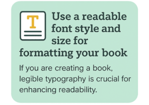
Now consider font size: If your text is tiny, people will struggle to read it. If it’s too big, you’ll be unnecessarily adding to your page count and printing costs. So, you should choose a standard, easily readable font style with a moderate size. An 11- or 12-point standard font such as Arial or Times New Roman is always a safe bet. For chapter headings, you might consider using a fancy font to add a decorative touch, but ensure it doesn’t compromise readability.
The genre of your book also determines the ideal font. Times New Roman and Garamond are widely used in fiction books, while Arial and Helvetica are popular in nonfiction books. So do your research before you choose your font!
#5 Format your text
Your text should be well-spaced, indented, and organized to create even paragraphs that are pleasing to the eye. Here’s how you can do this:
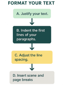
A. Justify your text
Justifying text is the process of aligning it to both right and left margins, creating straight lines on both sides. This is opposed to ‘ragged’ text, which is only aligned to the left margin. Justifying adjusts the space between your words to create a neat box of text, which is what you’ll find in most published books.
B. Indent the first lines of your paragraphs
Writers used to web content may wonder if this is strictly necessary, but it’s essential for novel formatting. Whether it’s a print book or an eBook, adding a 0.25-inch indent demarcates new paragraphs, improving the reading experience. It is important to note that the first paragraph, first line of a new chapter, or under a new subheading should typically not be indented, and using a first paragraph style helps maintain consistency throughout your document.
C. Adjust the line spacing
Line spacing is, quite literally, the space between two lines of text in a paragraph. It reduces eye strain and helps the reader keep track of the sentence. A line spacing of 1.3–1.5 is standard, but you should also consider your genre and target audience. You can have relative spacing for eBooks that adapt to reader preference and device settings.
D. Insert scene and page breaks
Scene breaks and page breaks are crucial for readers to reorient themselves while reading your book. Insert a scene break whenever there’s a significant change in the point of view, time, or location. This can be a simple flat line or an elegant little design, based on your preference.
Page breaks help you start each new chapter on a new page, acting as visual buffers. They’re integral to the structural organization of your book, so don’t forget them! Additionally, section breaks can be used within chapters to indicate different sections without starting a new chapter.
#6 Embellish chapter headings
Like page breaks, chapter headings are an important visual marker for your readers and play a crucial role in the layout of chapter pages. They should be set apart from the other text, and there are several ways to achieve this. You can use a different font that’s still coherent with your body font, genre, and theme. A good idea is to use your title font from the cover design, but that doesn’t work in every case.
Naturally, you’ll be using a larger font size for the chapter titles. You can additionally embellish them with graphic and design elements, but keep it simple. It is important to balance decorative elements with simplicity to ensure that chapter pages enhance the reading experience without becoming distracting. Start your text a few lines below the heading so it has some room to breathe. If your genre and theme permit it, you can start each chapter with drop caps, where the first letter is enlarged and ornate.
#7 Create front and end matter
The front and back matter of your book are the pages that appear before and after the main content. Roman numerals are often used to number these initial pages, such as the title page and table of contents, as well as to distinguish sections like the foreword or introduction in nonfiction works. This matter contains important supporting information that adds context to your book. Here’s what they contain:
Front matter
- Title page (book title, subtitle, and author name)
- Copyright page (copyright notice, publication date, and ISBN)
- Table of contents
- Dedication (allows the author to dedicate the book to someone)
- Foreword (an introduction written by someone other than the author)
Back matter
- Acknowledgments
- About the Author (a brief biography of the author)
- Appendix (additional information that supports the book’s content)
- Index (lists the book’s topics and page numbers for easy reference)
- Bibliography (lists the sources used in the book)
Various countries and genres have their own rules about book manuscript formatting for the front and back matter. Make sure to check these while you’re creating the pages!
Specific guidelines for print book formatting
Maintaining professionalism in printed books is crucial, especially when considering layout features like odd-numbered pages and footnotes.
Here’s how to format a book for printing:
- Consider whether your trim size, margins, and gutters are practical.
- Add headers and footers so you can place the page numbers, book titles, and chapter titles in them.
- Check the justification of your text and adjust the hyphenation accordingly.
- Add a bleed wherever images reach the edge of the page.
- Avoid widows and hyphens in your pages.
Bleed: A small border that stretches past the actual page to prevent a thin white line along the edge.
Widow: A paragraph-ending line that gets cut off from the rest of the paragraph and appears at the top of a new page.
Orphan: A paragraph-starting line that appears at the bottom of the page, cut off from the rest of the paragraph that’s on the next page.
Specific guidelines for eBook formatting
Here’s how to format an eBook:
- Ensure that the text is responsive so it can adjust to different device settings.
- Add hyperlinks to the table of contents, notes, and references to create an interactive experience.
- Optimize images and graphics so they’re adjustable and clear. Any non-design-related text edits made after the initial upload might incur an additional cost.
How to format a novel
Follow these steps for a polished novel manuscript format:
- Use scene break embellishments that fit your story and theme. Ensure that chapters always start on the right page to maintain reader engagement.
- Employ consistent indentation and punctuation for the dialogues.
- Highlight flashbacks, dreams, letters, or inner thoughts through font variations (such as italics) and use page breaks to ensure proper layout.
- Optionally, use specific formatting variations to denote different perspectives.
Best practices for formatting a book
1. Consistent font and size: Use a uniform font and size of font throughout the book. This consistency helps maintain a professional look and ensures that the book is easy to read.
2. Clear heading structure: Use a clear and concise heading structure to organize the book. This makes it easier for readers to navigate and find specific sections.
3. Proper line spacing and paragraph formatting: Line spacing and paragraph formatting are essential for readability. Format these elements according to standards to reduce eye strain and improve the reading experience.
4. Use professional tools: Tools like Microsoft Word or Adobe InDesign can make formatting the book easier and more efficient. These tools offer features that help ensure consistency and professional quality.
5. Proofread carefully: Proofread the book carefully to catch any errors or typos. A well-proofread book reflects your attention to detail and commitment to quality.
6. Consider a formatting service: Using a professional formatting service can help ensure that the book is formatted correctly and consistently. A professional service can provide an extra layer of quality control.
7. Reader-centric formatting: Format the book with the reader in mind. Use clear headings, well-organized paragraphs, and appropriate line spacing to enhance readability.
8. Appearance: Use a professional font and font size throughout the book. This helps ensure that the book is taken seriously by readers and industry professionals.
By following these best practices, you can create a book that is not only visually appealing but also easy to read and professionally formatted.
We hope you’ve learned how to format a book now. It’s a time-consuming, tedious process, so buckle up! But if you’d rather focus on writing and marketing than formatting your novel, our self-publishing services are at your disposal.
If you’d like to keep reading about the self-publishing process, here are some articles that could help:

Tanvi

With a foundation in Life Sciences, Tanvi enjoys curating technical writing tips tailored for ESL students. When she's not translating complex concepts into bite-sized nuggets, she can be found playing with dogs or painting landscapes.
One comment on “How to Format a Book in 2025: 7 Tips for Book Formatting”
Comments are closed.
Very nice write up and explains every aupect of book formatting.
Every one can understand what book printing is .